
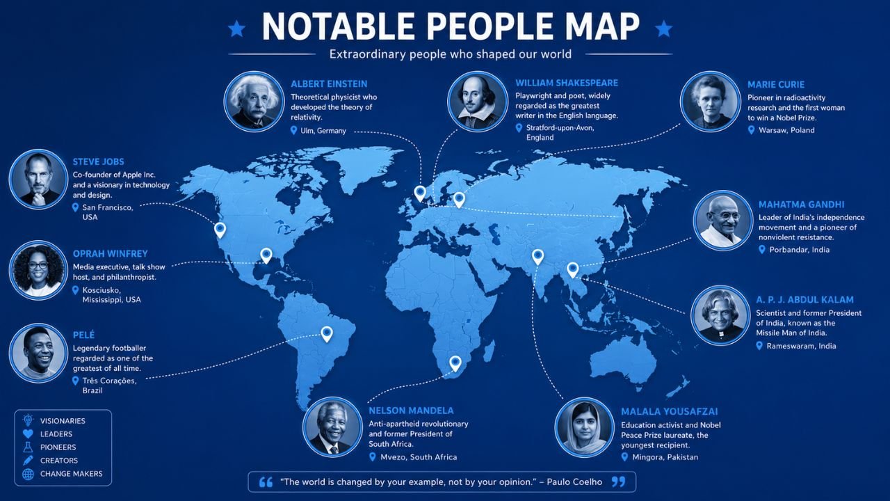
Have you ever wondered who the most famous person from your hometown is? That curiosity runs deep it connects identity, pride, and history in one simple question. The notable people map captures exactly that feeling, turning a massive dataset into something personal and endlessly fascinating. Whether your city gave the world a legendary musician, a revolutionary scientist, or a celebrated leader, this tool makes that connection visual and real.
This article walks you through everything about the notable people map how it works, what makes someone a notable person, how the most famous map rankings are built, and why this tool went viral worldwide. If geography, history, and human achievement excite you, you are in exactly the right place. Keep reading.
Notable People Map
The notable people map is one of the most talked-about interactive tools to emerge from the open data and visualization community. At its core, it answers a deceptively simple question: who is the most notable person born in any given location on Earth? The map was created by Topi Tjukanov, a map designer and developer at Mapbox, and it draws on a deeply researched academic dataset to power its results.
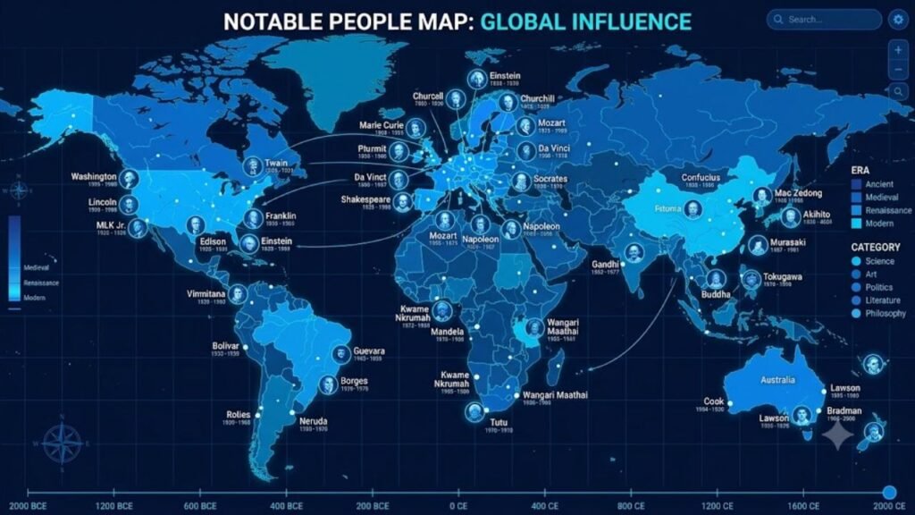
The tool plots birthplaces of historically significant individuals across the globe, showing only the highest-ranked person for each unique geographic location. When you open the map, you see names floating across continents from world-famous figures to surprisingly regional names you might never have encountered otherwise.
| Feature | Details |
| Creator | Topi Tjukanov (Mapbox) |
| Dataset Source | Morgane Laouenan et al. (Nature, 2022) |
| Total People in Database | 2.29 million individuals |
| Time Range Covered | 3500 BC – 2018 AD |
| Data Verification | Cross-verified via Wikipedia + Wikidata |
| Interactive Tool | Built with Mapbox GL JS |
| Categories Available | Culture, Discovery & Science, Leadership, Sports |
The notability ranking system determines which name appears at each location. As you zoom in, more names appear showing not just the globally famous, but also regionally significant figures you might recognize from your own community. It is a genuinely addictive experience that blends data science, history, and geography into one elegant visual.
What makes this map especially powerful is its democratic scope. It does not limit itself to Western celebrities or modern figures. Ancient philosophers, medieval rulers, 20th-century athletes, and contemporary entertainers all share the same canvas. The result is a living portrait of human achievement, mapped across time and space.
Notable People
Understanding what makes someone a notable person is central to appreciating this map. Not every famous person in popular culture makes the cut, and not every person on the map is a household name. The dataset behind the notable people map uses a synthetic notability index built from five measurable dimensions that reflect real-world historical significance.
These five dimensions work together to create a composite score. A person who scores highly across all five dimensions ranks near the top of the notability ranking, regardless of how recent or ancient their life was. This makes the system surprisingly fair across different eras and geographies.
- Wikipedia language editions: The number of languages in which a person has a Wikipedia article.
- Biography length: Total word count across all available Wikipedia biographies.
- Page view average: Average biography views between 2015 and 2018 across all language editions.
- Data completeness: Number of non-missing items for birth date, gender, and domain of influence.
- External links: Total number of external references from Wikidata pointing to the person.
The five-dimension scoring system is elegant because it rewards genuine cross-cultural impact. A person with a short English Wikipedia article but extensive coverage in Arabic, Chinese, and Spanish editions can still rank highly. This matters enormously for reducing linguistic bias in historical fame rankings.
| Notability Dimension | What It Measures | Why It Matters |
| Wikipedia editions | Cross-language presence | Global recognition |
| Biography length | Depth of documentation | Historical significance |
| Page view average | Contemporary interest | Public relevance |
| Data completeness | Information quality | Accuracy reliability |
| External links | Citation footprint | Academic authority |
Wikidata and Wikipedia together form the backbone of this cross-verified database. Researchers cross-checked entries across sources to minimize errors, though they acknowledge that figures from non-Western linguistic traditions remain somewhat underrepresented. That acknowledged limitation makes the dataset more trustworthy, not less the researchers were transparent about its boundaries.
One remarkable finding from the underlying academic study is that the database represents roughly 1 in every 43,000 humans who have ever lived. That elite fraction 2.29 million out of an estimated 100 billion total humans constitutes what the researchers describe as the most thoroughly documented set of notable individuals ever assembled for social science research.
Most Famous Map
The concept of a most famous map is not entirely new, but Tjukanov’s version became a viral sensation in 2022 because of its global scope, intuitive interface, and the irresistible personal hook: who represents your hometown? Earlier versions of similar tools, like The Pudding’s People Map of the U.S., focused only on American cities. Tjukanov expanded the idea to the entire world.
When the map launched in late July 2022, it quickly climbed to the top of Hacker News and was featured across dozens of major news outlets. The appeal was immediate and universal. People from Boca Raton to Zanzibar could look up their hometown and find a face sometimes surprising, sometimes obvious, always interesting.
The most famous map experience works on multiple levels. At a global zoom, only the most universally recognized names appear figures like Leonardo da Vinci, Cristiano Ronaldo, and a handful of ancient religious leaders. As you zoom in to a regional level, national figures emerge. Zoom into a city, and you might find a beloved local athlete or a politician you have never heard of outside that region.
| Zoom Level | Typical Names Visible | Why This Matters |
| Global view | Da Vinci, Ronaldo, top historical figures | Universal cultural impact |
| Continental view | Major national leaders, prominent artists | Regional cultural significance |
| Country level | National heroes, major celebrities | National identity markers |
| City level | Local athletes, regional politicians | Hyperlocal pride and identity |
| Neighborhood level | Niche figures, minor historical persons | Deep historical granularity |
The categories feature adds another layer to the most famous map experience. Switching between culture, discovery and science, leadership, and sports and games reveals entirely different landscapes of fame. A city whose top overall figure is a politician might yield a beloved soccer player under the sports filter completely changing your mental picture of that place.
The notability rank value and sum value together determine how large or prominent a name appears on the map. Higher-ranked individuals get larger text, making it visually clear who the dominant figure is before you even click for details. Each clickable pin reveals a thumbnail with the person’s notability rank, gender, living or deceased status, and a direct link to their Wikipedia page.
What Is the Notable People Map and How Does It Work?
Many people encounter this tool through a social media share and immediately want to understand the mechanics behind it. The notable people map is an interactive web application built on Mapbox GL JS, a powerful JavaScript library for rendering customizable maps in the browser. The underlying geospatial data was processed using PostGIS, a spatial database extension for PostgreSQL that handles geographic queries at scale.
The data pipeline starts with the Laouenan et al. academic dataset, published in Nature Scientific Data in June 2022. This dataset took years to build, combining web scraping, natural language processing, and deduplication algorithms to merge overlapping records from multiple Wikipedia language editions and Wikidata. The result was the most comprehensive biographical database ever assembled for social science purposes.
Once the dataset was processed, Tjukanov applied a geographic filter: for every unique set of coordinates, only the person with the highest notability score is displayed. This one-person-per-location rule is what keeps the map readable and drives the discovery experience you are always seeing the single most significant figure from each place, not a cluttered list.
The map’s rendering logic means that as you zoom in, the geographic resolution increases. A single dot representing “central France” at the global zoom might resolve into dozens of distinct birthplace locations as you zoom to the department level, each with its own highest-ranked notable person. This zoom-dependent rendering is what makes the tool feel inexhaustible there is always another layer to explore.
Notable Map
The notable map sits at the intersection of data journalism, open data advocacy, and geographic visualization. It represents a growing movement to make academic research accessible and engaging to general audiences. Where the original Laouenan et al. study was published in a scientific journal with technical methodology sections, Tjukanov transformed the same data into something anyone can use in seconds.
This kind of data visualization has a meaningful secondary effect: it exposes historical bias in how fame is recorded. Because the dataset relies on Wikipedia and Wikidata, it reflects those platforms’ own well-documented gaps. Figures from sub-Saharan Africa, South and Southeast Asia, and pre-colonial Americas appear less frequently than their actual historical significance might warrant. The researchers who built the original dataset acknowledge this openly.
- Linguistic bias skews results toward figures documented in Western European languages.
- Historical recency bias means modern individuals have more Wikipedia presence than ancient ones.
- Gender bias is significant women are substantially underrepresented across most time periods.
- Geographic coverage gaps exist in regions with historically lower Wikipedia editor participation.
- Domain bias reflects Wikipedia’s tendency to over-document entertainment and sports figures.
Despite these acknowledged limitations, the notable map remains a genuinely remarkable achievement. The fact that a single developer at Mapbox could take peer-reviewed academic data and turn it into a globally viral interactive tool speaks to the power of open data, accessible mapping APIs, and civic curiosity. The map sparked real conversations about which lives get recorded in history and which do not.
The notable map also inspired follow-on projects and inspired discussions about algorithmic fame the idea that historical significance can be quantified through data signals rather than subjective editorial judgment. That philosophical question sits beneath every single name floating on the map.
How Is Notability Ranked on the Notable People Map?
This is one of the most searched questions about the tool, and the answer involves both statistics and some genuine philosophical complexity. The short version is that notability ranking on the notable people map is a composite score built from five quantifiable Wikipedia and Wikidata signals but the longer version reveals interesting tensions in how we define historical importance.
The scoring system deliberately prioritizes cross-linguistic presence over any single language’s coverage. A figure who appears in 40 Wikipedia language editions but has a relatively short article in each one can outrank a figure with a very long English Wikipedia article but minimal presence in other languages. This means the rankings genuinely reflect global cultural impact rather than Anglophone media dominance alone.
One of the most discussed quirks of the ranking is that Madonna ranks 32nd while Jesus Christ ranks around 2,000th. At first glance, this seems absurd. But it reflects a real methodological reality: ancient figures have far fewer Wikipedia page views, fewer external links, and less complete Wikidata records than modern celebrities who benefit from the internet age’s documentation infrastructure. The ranking measures documented notability rather than absolute historical importance.
| Rank Range | Typical Figures | Dominant Domain |
| 1 – 50 | Modern global celebrities, major political leaders | Entertainment, Sports, Politics |
| 51 – 500 | Major historical figures, leading scientists | Science, Arts, Literature |
| 501 – 5,000 | Regional heroes, influential thinkers | Philosophy, Religion, Military |
| 5,001 – 50,000 | National figures, specialized achievers | Various domains |
| 50,000+ | Local notable persons, historical niche figures | Highly specialized fields |
The sum value alongside the rank determines the visual weight of a name on the map. High-sum individuals appear in larger text, creating a natural visual hierarchy that mirrors the data. This design choice makes the map immediately readable without requiring the user to click every name to understand relative significance.
Which Categories Can You Filter on the Notable People Map?
The category filter system is one of the most powerful and underused features of the notable people map. By default, the map shows the overall highest-ranked notable person for each location. But switching to a specific category can reveal an entirely different landscape of fame for the same geography.
The four available categories reflect the broad domains used in the original Laouenan et al. dataset. Each category uses the same notability ranking methodology but restricts candidates to individuals whose primary domain of achievement falls within that field. The result is four distinct maps layered over the same geography.
Culture covers artists, writers, musicians, filmmakers, and other creative professionals. This is typically the richest category for major cities with long artistic traditions. Discovery and Science surfaces scientists, inventors, mathematicians, and explorers a category where European cities in particular show remarkable density given the continent’s role in the Scientific Revolution and Enlightenment. Leadership covers political figures, military leaders, religious heads, and rulers throughout history. Sports and Games pulls forward athletes, chess champions, and competitive sports figures whose global recognition often exceeds that of local politicians or scientists.
Switching between these filters is genuinely illuminating. A city that shows a political leader on the default view might yield a legendary musician under culture, a Nobel laureate under science, and an Olympic gold medalist under sports. Each filter tells a different story about the same place.
Where Did the Data for the Notable People Map Come From?
The notable people map stands on an unusually solid academic foundation for a viral internet tool. The underlying data comes from a peer-reviewed study titled “A Cross-Verified Database of Notable People, 3500BC–2018AD,” published in Nature Scientific Data in June 2022 by Morgane Laouenan and colleagues.
The research team built their database by collecting biographical data from seven language editions of Wikipedia (English, French, German, Spanish, Italian, Portuguese, and Dutch) and from Wikidata, the structured data repository that underpins the Wikimedia ecosystem. They then used deduplication algorithms to merge records of the same person across sources and cross-verified key biographical attributes like birth date, birthplace, gender, and primary domain of achievement.
The final database contains 2.29 million individuals who lived between 3500 BC and 2018 AD. The researchers estimate this represents roughly 1 in every 43,000 humans who have ever lived a remarkable concentration of the historically documented elite. The study was driven by social science questions around gender, economic growth, urban development, and cultural diffusion across history.
Why Did the Notable People Map Go Viral?
Understanding the virality of the notable people map tells you something important about what makes data visualization compelling. The tool launched in late July 2022 with a simple tweet from Tjukanov asking his followers to check who the most notable person from their hometown was. Within hours, the response was enormous. By the next day, it had reached the top of Hacker News and was being covered by major publications worldwide.
The viral mechanics were almost perfectly designed, even if unintentionally. The tool offered immediate personal relevance everyone has a hometown, and most people feel genuine curiosity about its famous connections. It also offered social sharing fuel, since the results were often surprising, funny, or pride-inducing. Discovering that your suburb’s top figure is a 19th-century mathematician you have never heard of is inherently shareable.
The tool also benefited from its accessibility. No login, no paywall, no download just a browser and a few seconds of loading time. This frictionless access meant that journalists, educators, history enthusiasts, and casual users all encountered the same clean, beautiful experience. The Mapbox GL JS rendering made the globe feel tactile and responsive, adding to the sense of genuine exploration.
The discussion it sparked about historical bias, Wikipedia underrepresentation, and algorithmic fame gave it intellectual staying power beyond the initial novelty. People did not just share the map they wrote essays about it, debated its methodology, and used it as a jumping-off point for deeper conversations about how history gets recorded and who gets remembered.
What Are the Limitations of the Notable People Map?
No tool built on Wikipedia data is without acknowledged limitations, and the researchers and creator of the notable people map have been admirably transparent about the gaps. Understanding these limitations helps you use the tool more thoughtfully and appreciate what it does well alongside what it cannot fully capture.
The most significant limitation is linguistic bias. The dataset was built primarily from Western European language editions of Wikipedia. This means that historically significant figures from East Asia, South Asia, the Middle East, Africa, and the Americas are often underrepresented relative to their actual historical importance. A Chinese philosopher with enormous influence in Asian intellectual history might rank lower than a minor European nobleman simply because the European figure has more Wikipedia language coverage.
- Historical recency bias benefits modern figures who have Wikipedia pages with high view counts.
- Gender underrepresentation is significant women make up a minority of the database across most eras.
- Domain skew favors entertainment and sports in modern periods due to higher Wikipedia engagement.
- Birthplace data gaps mean some figures appear with incorrect or imprecise geographic coordinates.
- Living status uncertainty is sometimes recorded as “probably alive” rather than confirmed.
These limitations do not make the notable map unreliable they make it a product of its sources. Wikipedia itself has active communities working to address underrepresentation, and future versions of the dataset are expected to improve coverage as Wikipedia expands into more languages and communities. The map is best understood as a snapshot of documented historical fame rather than a definitive ranking of objective historical importance.
FAQs
What is the notable people map?
The notable people map is an interactive web tool that visualizes the birthplaces of historically significant individuals worldwide. It uses a cross-verified dataset of 2.29 million people ranked by a notability score.
Who created the notable people map?
The notable people map was built by Topi Tjukanov, a map designer at Mapbox. It was inspired by The Pudding’s People Map of the U.S. and uses academic data from a Nature Scientific Data study.
How does the notability ranking work on the notable people map?
The notable people map ranks individuals using five dimensions: Wikipedia language editions, biography length, page view averages, data completeness, and number of external Wikidata links.
Can I filter the notable people map by category?
Yes, the notable people map lets you filter results by four categories: Culture, Discovery and Science, Leadership, and Sports and Games. Each filter shows a different set of top-ranked individuals per location.
Why do some modern celebrities rank higher than ancient figures on the notable people map?
The notable people map uses Wikipedia-based signals like page views and language editions. Modern figures naturally accumulate more digital documentation than ancient ones, which inflates their notability scores relative to historical importance.
Is the notable people map data accurate?
The notable people map is based on a peer-reviewed academic dataset that is highly accurate for well-documented individuals. Error rates increase for lesser-known figures due to sparse Wikipedia data and occasional classification issues.
How often is the notable people map updated?
The current version of the notable people map uses data covering people born between 3500 BC and 2018 AD. The researchers described the dataset as an evolving object, though real-time updates are not part of the current public tool.
Conclusion
The notable people map is more than a fun internet tool it is a genuinely illuminating window into how human achievement gets recorded, ranked, and remembered. Every time you zoom into a corner of the globe and see a name appear, you are looking at the product of centuries of documentation, filtered through one of the most ambitious open-data projects ever attempted. The notable people map reminds us that history is not evenly distributed, and that every city, town, and village has contributed someone remarkable to the human story.
Using the notable people map is also a quiet lesson in epistemic humility. The rankings reflect what we have documented, not necessarily what matters most. The gaps in the data around gender, language, and geography are invitations to look harder, document more, and expand our picture of who the notable people of history really are. The notable people map is ultimately a starting point, not an endpoint.
Meta Description: Explore the notable people map to find the most famous person born in any city worldwide. A data-driven, interactive tool you need to see.

Alex Carter is a technology writer covering AI, software, cybersecurity, and digital trends, delivering expert insights and practical guides.